Archive for the ‘ideas’ Category

Love Cards from ID Exclusive

February 1, 2016

IMG_5650

February 2016 Curator’s Note:

The theme for this month’s collection is (not surprisingly) “love”.

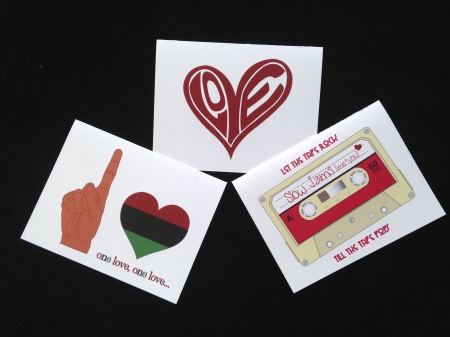
Of course the love theme was inspired by Valentine’s Day which suggests romantic love, but I wanted this collection to speak to more than just that.  I’ve included a “love card” that is a nod to Black History Month which also celebrated in February; a love card describing the necessity of love in general with whomever or whatever (“all I need to get by”), and a love card that speaks to the love of music, one of my first loves.

Once again, each card is infused with some old school hip hop flavor.  The hip hop/soul inspiration this month comes from Method Man and Mary (All I Need), the Notorious B.I.G. (Juicy), and Whodini. (One Love).

What I love about these cards is that they are not just “romantic love” cards — although they can be.  I kept the love theme fresh and light so that they could apply to a wide variety of love relationships, and can be appropriate for use all year long.

The cards read:
“LOVE”, inside reads “All I need to get by”
“one love, one love…” (blank inside)
“let the tape rock till the tape pops/Slow Jams (me+you) mixtape” (blank inside)

I hope you enjoy the nostalgia of these note cards and send some love this month.

Love write, people!
-ID

Hip Hop Quotables from ID Exclusive

January 2, 2016

IMG_5205January 2016

Curator’s Note:

Happy New Year!  The theme for this month’s novelty collection is “Inspiration”.

I’ve long been inspired by motivational quotes and I collect quite a few of them.  One quote that really inspired me to launch ID Exclusive reads “By being yourself, you put something wonderful in the world that was not there before”.  I love helping my clients bring their visions to life on paper, but I haven’t really been doing the same for myself.  Launching ID Exclusives allows me to share some of what I really like.

I’ve incorporated some of my “likes” in this month’s collection: quotes, music, quality stationery, simple and clean design.  Not only am I achieving a personal goal this month with this launch, but I’m also sharing my individuality by putting new and unique novelty stationery in the world.  I hope this inspires you as well.

January is the first month of a new year and I’m tapping in to people’s feelings of renewal and reinvention.  It’s time for a fresh start, and I want to help communicate happiness, confidence and capability.

I wanted the font I used to be a little serious, but the quotation to be unexpected, inspiring, fresh, and fun.  The quotes are inspirational and recognizable old school hip hop verses from Nas, L.L. Cool J, and Rob Base.

These flat note cards are rich in quality.  The letter pressed cards feature over sized quotation marks on a bright white double-thick card stock, with print in a bright gold that matches the envelope.  The bold, yet understated impression works perfectly with the gold shimmer envelope and speaks to the festive new year, new individual goals, and fresh flavors.

The quotes read:
“I’m on a mission…you better just listen.”
“Whose world is this?  …the world is yours.”
“I’m gonna take this itty bitty world by storm…and I’m just gettin’ warm.”

I hope you enjoy them as much as I do!

Visit our Etsy store or call the office (973.482.4246) and place your order today!

Write on…
-ID

Let’s get social!
Follow us on Instagram
Like us on Facebook
Check us out on the web


Introducing “ID Exclusive”

December 7, 2015

Allow us to introduce “ID Exclusive” by ID Stationery.

IMG_4815


For years, ID Stationery specialized primarily in custom stationery designs for your business or individual needs.  We will continue to create custom stationery but we are now including stock cards (non-customized) to our repertoire, and we’re calling the new offering ID EXCLUSIVE!

ID Exclusive, a collection of novelty hip hop and soul inspired stock cards designed and curated monthly by ID Stationery, is set to officially launch in January 2016, but we’ve got a holiday sneak peek available for purchase now!

The ID Exclusive December collection includes the following:

1) “You’re jingling, baby” card (interior reads: “Go ‘head, baby…Have a Happy Holiday!”)

2) “Ain’t No Mountain High Enough” card (interior reads: “Wishing you a soulful holiday season”)

3) “Rock the Bells” card (interior is blank)

4) Corresponding envelopes and a stylish USPS forever stamp for each card

This month’s collection is sold as single cards, a 3-pack, or a 12-pack.

Visit our Etsy store or call the office (973.482.4246) and place your order today!

Let’s get social!
Follow us on Instagram
Like us on Facebook
Check us out on the web

3 Is The Magic Number!

January 10, 2013

My daughter turned 3 this past November and I had so much fun designing her birthday party invitations.  The idea for her invites came to me the summer before her birthday as I was in the office designing another project and listening to De La Soul’s 3 Feet High and Rising album.  It occurred to me that although it was an adult album, it had a lot of qualities — and song titles that could be appealing and appropriate for a 3 year old — and the cover art was fun and young too!  I decided to make her party invite in the form of CD complete with album cover art.

The original album art looked like this:

3FeetHighandRising delafrontback

The final invite looked like this:

IMG_2138

I created a CD sleeve that had images of the birthday girl at different stages in her life (at 1 years old, at 2 years old, and a recent – almost 3 year old picture).  The back of the CD sleeve had a few of the song titles from the original album that worked for a 3 year old (“3 is the Magic Number”, “Say No Go”, etc.), and I tweaked a few of the titles to go specifically with Indigo, the birthday girl.  The actual CD was made of a die cut silver shimmer card stock and contained the actual party information.  The invite was visually appealing to the kids who received it and quite nostalgic to their parents, who may have enjoyed the classic De La Soul CD in their teen years.

I also created corresponding Thank You cards and favor tags.   The art on the Thank You card resembled the art on the cassette for the same album.

cassetteartThe thank you cards looked like this (and again the wording was tweaked a little):

IMG_3170

As predicted, the parents loved the invites and the kids loved seeing their friend’s face in print…and the birthday girl, was indeed, 3 Feet High and Rising.

Look to the ball…

April 5, 2012

So my soon-to-be 4 year old son has recently decided that he “loves” football.  So of course when I asked him what kind of birthday party he’d like to have, he naturally wanted a “football” party.  Of course he does!  What does this mean for a 4 year old you ask?  They don’t play football, don’t know the rules, and don’t just ram into people (not usually anyway).  I’ve concluded (quite correctly, i might add) that he really likes the shape of the football, and enjoys rolling around on the floor with his brother (his version of a “tackle”).

So in designing his card my first idea was to create an invitation with an image of a football field  – complete with a goal post, and the ball flying in the air — and maybe have the invite copy printed over the “field”…it would have been really nice too.  but then i thought about what he really likes about football — and it’s really all about the ball!  i figured kids would love to receive an invite actually shaped like a football.  it’s a simple enough idea, but i think it pops more than a traditional rectangular invitation.  so with my kids as the product testers, i determined that i was right!  each of them (2, almost 4, and 6) loved the football card right away — they each wanted one of their own.

so that’s what i did for his party invite:  i made die-cut football cards.  and the kids — my birthday boy especially — loved them!  i bet the invitees will too!

the final product looked like this:

a football shaped die-cut card with the invite copy printed on the “pig skin” — i raised the ball detail high so that the writing would fit — and you’d still be able to see the football detail.   i used a fun “kid” font, and used some kid friendly “football-esque” lingo.  i complimented the return card with the same football image in the return address area and used the same fun kid font.

now i need to think of other creative ways to make the actual party “football-y”…

Village People Inspiration

March 29, 2012

ID Stationery was commissioned to create birthday invites for a soon-to-be three year old girl.  Her mom was having her party at a place called “Kidz Village” (www.kidzvillage.com), which is a children’s play facility with an indoor playground and other “imagination rooms” themed after typical city venues (movie theater, diner, hair salon, supermarket, comic book store, dance school to name a few).  in each “imagination room” the children can dress up and play appropriate roles of the “workers” in each room.  it immediately reminded me of the Village People (you remember the song Y-M-C-A?).

The client wanted to definitely have pink on the invite, and i really wanted the invite to convey something about the party venue.  after discussing my ideas with the client, here’s what we came up with:

Kidz Village Invite

Kidz Village Invite

we decided to go with a long invite for a different feel (and it also perfectly fit the images i wanted to incorporate), and the fuschia border to incorporate the pink the client wanted.  again drawing from the Village People idea, i used images of a diverse group of young children dressed as different townspeople to not only appeal to the recipients of the invite, but to also reflect how the kids will have an opportunity to play dress up at “Kidz Village” too.  I added a catchy rhyme tying in the birthday girl’s age and letting the invitees know that they could be “whatever they want to be” at Kidz Village.  i used rounded edges to soften the look of the card, and used an open ended envelope, also in fuchsia to make it more “fun”.

both the client and i was were very pleased with the final product!  she even ordered matching thank you cards!

menu of inspiration

March 16, 2012

ID stationery was recently commissioned to create menus for a new restaurant opening in the area.  i was so excited for the opportunity!  in thinking of how i wanted to design this menu, i tried to think of memorable menus i’ve used at restaurants.  most menus are boring and non-memorable, but the one menu that did come to mind was the cheesecake factory menu.  it’s different because it’s spiral bound, and you don’t see that often.  my issue with using that form was that the cheesecake menu was literally like a book!  their offering seems never ending, and this was a small restaurant — with a pretty typical size offering.

cheesecake factory menu

cheesecake factory menu

i decided to give that menu format a go anyway!  the menu is a 4-pager (double-sided).  the client provided beautiful pictures of her own food, and we decided to use that as a backdrop.  the new restaurant boasts healthy, delicious comfort food — with an emphasis on healthy, so we featured a “healthy image on the menu cover, and appropriate dishes on each page.  we were really happy with the final product, and best of  — the client loved it too!

the final menu for Vonda's Kitchen in Newark, NJ

the final menu for Vonda's Kitchen in Newark, NJ

Inspiration for a Carry-On Bag

March 8, 2012

we were recently asked to create favor tags for the launch party of “Love In A Carry-On Bag” a new african-american fiction novel by Sadeqa Johnson due out in March 2012 (currently in stores!).  the party planner had gotten some cute mini carry-on suitcases (with wheels!) to serve as containers for “love candies” (heart candies/kisses/etc) to distribute to guests as favors.  she was looking for “luggage tag” style favor tags to don the “carry-on luggage”. she wanted the tag to resemble a luggage tag, to complement the colors on the book cover, and also tie into the storyline of the novel.

at the time of the request the book had not yet been released — and i didn’t really know the storyline.  well after asking a few poignant questions (and the party planner not giving away too much of the story), i decided to go to work.  the book cover was my starting point and it looked like this:

available where books are sold on march 6th

available where books are sold on march 6th

after studying the cover, i decided that i wanted to be sure to incorporate some hot pink, purple and grey on the favor tag.  i learned that the story was about a couple in a long-distance relationship one traveled by car, the other by train to be together.  i thought it would be nice to incorporate the method of travel on the tag as well, and i also felt that because it was a favor tag, we should probably also include some sort of message/text as well — a type of well wish, or some form of gratitude (favors are “thanks-yous” after all).  i wanted to do all this on this small tag — while keeping the the overall look and feel of the tag clean, uncluttered, elegant…and in line with what i understood the “style” of this project to be.

here’s what i came up with:

here are the tags i came up with

here are the tags i came up with

i tried to imitate the name and look of the book title a bit, with the exception of the quotes around “love”.  i kept that main font color hot pink, like the book title.  i added a simple, slightly curved (read: elegant) train track to represent train travel, and i incorporated the purple in the track.  the message, i put in grey and in a slightly smaller font, alluding to both the gift (“love” in a carry-on bag) and the event (book launch/reading).  i added metal eyelets around the holes (in a mix of pink, purple and brushed nickel) to give the tag a just a bit more substance.  then i framed the tag in hot pink to bring it all together.

the client loved it (and so did i).

the final product looked like this:

the final product

the final product

i had the pleasure of attending the launch party and i must say the favors looked super cute at the dessert bar among all the other beautifully displayed sweets (this picture doesn’t begin to do it justice).  i also picked up a copy of the book…such a great read. GO GET YOUR COPY TODAY!!  if you can’t make it to a bookstore, get it online (amazon.com) stat!

happy reading!!

pacmania

February 19, 2012

my mission was to design invites for a soon-to-be six year old girl who was having a video game themed birthday party. I was excited about the project because when presented with the idea, I drew a blank. I actually like when this happens because that means not only will I be doing something new, but it’ll also be a challenge — and I (generally) love new challenges.

reasons I drew a blank:  I typically think of video games being for boys (fighting, racing, etc)…but furthermore, I know very little about video games in general. The only cute girly video game I could think of was Ms. Pacman…but that’s such a “vintage” game, and I wasn’t even sure if it would even resonate with a six year old.  i also assumed they would think ms. pacman graphics were primitive and boring.

so I did some research as I always do to spark some inspiration, and ultimately, I just didn’t come up with anything I liked more than the ms. pacman idea, so I decided it was best to go with what I liked.  As the saying goes: “always go with your first self”.   I presented the client with a few other game related invite proofs and three different Ms. Pacman themed invites.  I really started falling in love with the idea of a Ms. Pacman invite. I was so glad that the loved one of my favorite proofs…the retro ms. pacman!

I used a simple ms. pacman image complete with ghosts and a few cookies (pellets?)…kept it in line with the clients desired color scheme. I used fonts that complimented the retro video game look and feel…and I loved the way it turned out.

in addition to using a simple image of ms. pacman and a few ghosts, i also used a “pac man” font for the highlight phrases, and a font that reminded me of the primitive graphics of ms. pacman’s day — but also was modern enough for today — one with a square, almost digital feel.  i kept it colorful and feminine — i used game “verbiage” for the thank you cards (“thanks for playing”), and the favors were mini gumball machines, so we used wordplay with the word “ball” on the favor tags.

they turned out to be a fun, funky, feminine retro invite — that kept with the video game theme.

the final ms. pacman invite
the final product

chewy inspiration

February 11, 2012

my client who was having twins needed baby shower invites, but had no idea what theme she wanted — or even what gender her babies were.  all she knew was that she needed suggestions, she needed them quickly, and she knew that ID Stationery could help.

i like to think of pop culture references that my client (and their guests) can relate to, and with twins i automatically thought of the doublemint gum commercial.  you remember:  “double your pleasure, double your fun” — the commercials featured twins, both male and female.  i thought this might do the trick.

after sharing my vision with the client — she loved it!  so i went to work. i thought it would be cool to have the invite look like a pack of doublemint gum.

this is where the idea started:

the inspiration: doublemint gum

the inspiration: doublemint gum

here’s what we came up with:

double infant invite

the final invite and gum favor

i personalized the card as much as i could.  used the client’s last name (mcgee) instead of “wrigley’s”, and instead of “doublemint”, i went with “doubleinfant” (i know it didn’t rhyme exactly, but the “int/ant” sound brought it together i thought).  in place of the price, we had a countdown to the babies’ arrival (from the date of the shower).  i remembered the “Plen-T-Packs” of gum, and thought that would be a cute thing to add.  instead of putting the quantity of sticks, i put the quantity of kids.  I changed “naturally and artificially flavored” to “naturally sweet, no artificial flavors”…and i made it a “new” product.  i finished it off by putting it in an open ended kraft colored envelope — which reminded me of the little brown bags you would get from the candy store.  the card was a hit, and it worked out well as it was also gender neutral.

the client asked if we could take the idea further and actually make gum wrappers, as she wanted to give out packs of doublemint gum out at the shower.  i was excited to oblige.